
Introducing the new SSI branding
Posted by d.barclay on 19 April 2023 - 2:00pm
By Denis Barclay, SSI Communications Officer.
The Palette
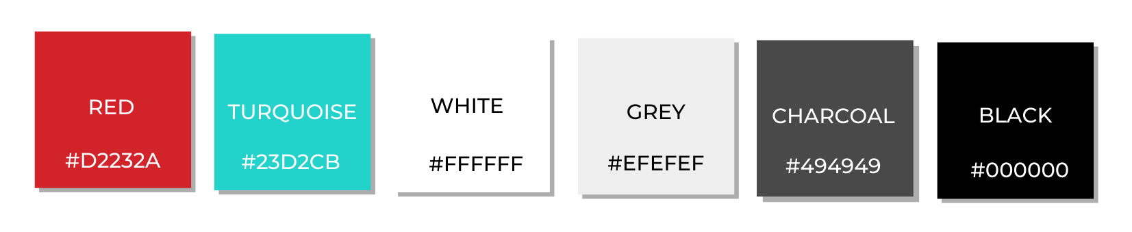
The first thing that comes to mind when we think about different brands is colour. Understanding colour gives us an insight into an organisation's identity and what they stand for. In the case of the SSI, it is hard to think of anything but the signature red colour that has been the protagonist of the Institute's branding over the years. Red is a bold colour that suggests strength and dominance. When it was chosen to represent the SSI it was the symbol of a promise and a hope, that the Institute would prove and assert itself as a leader in what was the research software niche sector.
In the new palette, red takes a step back and is reserved for the logo and other subtle graphic elements. It does not need to shout for attention but creates a connection between past and future and symbolises the promise it fulfilled.
Charcoal, grey, black, and white are the new main colours. They convey a sense of integrity and professionality and act as the perfect contrasting background for the red logo to stand out.
Turquoise is a new addition to the palette. It is bold and complements the red but it should not be abused. It should only provide an accent of colour whenever a design or page needs some added vibrancy.
The Logo
If colour is the first thing we associate with brands, logos are surely second. Logos represent the brand's identity, convey a sense of belonging and pride, and create an immediate association between the public and the organisation.
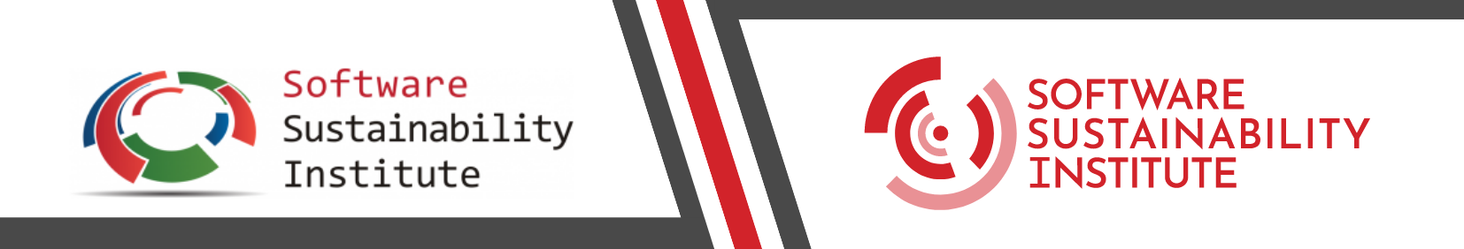
The Original SSI Logo
The previous SSI logo is a product of its time. Many of its features, from the 3D effect to the shading and bottom shadow, were popular once. As a result, the design is busy and not very accessible, with the green and red fighting for dominance and drawing attention away from the wordmark. The icon is characterised by its distinctive circular segments coming together, a theme that represents what the SSI stands for.
The previous logo uses lowercase letters. The debate about uppercase and lowercase letters in branding has attracted an array of contrasting opinions over the years. On one side, lowercase letters convey warmth and accessibility, while on the other, uppercase letters are associated with competence and confidence.
The design of the logo is in contrast with the signature red colour that has represented the SSI for so many years, with the first being as unassuming as the latter is bold. On the one hand, the logo seems to take a step back, reflecting the uncertainty of the Insititue's early years, while on the other, the red represents its desire to affirm itself as a leader in the field.
The New SSI Logo

The new SSI logo does not cut ties with the past but acknowledges the growth of the Institute. It is a flat logo characterised by simple but distinctive high-contrast shapes and typography, which stand out and are flexible and easy to read.
The new icon of the SSI logo is a modern, simpler, and bolder version of the previous one. The circular segments are still coming together, but now their aim is focused towards a single circular dot in the middle, reflecting how the SSI has sharpened its objectives over the years.
The new logo is monochrome, with red taking centre stage, drawing the viewer's attention and popping out against a white or light grey background.
The wordmark uses uppercase letters, indicating a rise in confidence and pride. The typography gives the logo added easily recognisable features like the distinctive letter W.
The new logo is unmistakably bold and showcases the SSI in its current leadership role. Because of its boldness, the red logo should be prioritised over any other version and always used against a white or light grey background. The logo should be the only red element on a page or design (apart from minimal accent elements as appropriate). This ensures the logo maintains its distinctiveness without becoming overpowering.
The Associated Logos
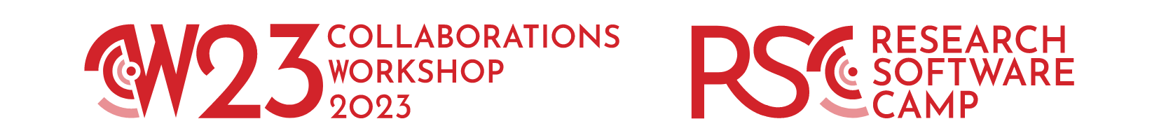
The Collaborations Workshop (CW) and the Research Software Camp (RSC) logos use elements taken from the SSI logo to highlight their belonging to the array of activities carried out by the Institute.
The icon has been cropped to form the C in both acronyms. The central dot is left intact, highlighting it as the focal point of both logos.
The CW logo also incorporates the distinctive W that characterises the typography. The CW logo will be updated to reflect the change of year.
The RSC logo letter S connects the letter R to the icon like a sinuous path, which represents the learning process, a fundamental aspect of the RSCs.
Both these logos aim to create an immediate association between these activities and the SSI while also giving them their own identity.
Find out more about the new SSI branding guidelines here.
Download the new SSI Brand Guidelines here.
If you have difficulties seeing the logo at the top of the website, please clear your cache.