
Building a better data trap, or why data structures matter
 By Melodee Beals, Digital Historian at Loughborough University and Software Sustainability Institute fellow
Originally posted at mhbeals.com
Historians appear to be quite happy with tables. Tables are neat, orderly repositories of information. Rank and file, we input our names, dates, and other titbits of historical data. Rank and file, we organise our world into an unending supply of lists — lists providing the relevant percentages, absolute enumerations or qualitative descriptions of anything we can imagine. Over the years, of course, our tables have evolved from mere typographical conventions to function-laden spreadsheets, capable of statistical and algebraic functions, textual concatenation, and a host of other minor miracles. Yet, for all the seeming convenience of Microsoft Excel (and its ilk), we pay a hefty price — our time and sanity. “Hyperbole!” I hear you shout. “Nonsense!” I hear you cry. And, when these initial protestations fade, we are left with the ever popular: “I have a system.”
The best laid plans
I’m sure you do; I did. For a very long time, I thought it was an excellent, thoughtful and robust system of rows and columns, worksheets and workbooks, directories and hard drives. I had a worksheet in which I inputted my raw data and another for each set of outputs and visualisations I required, using a complicated combination of vlookup, =, countif, sumif, of conditional formatting and filters, of pivot tables and inset graphs to achieve almost magical transformations. It was not long, however, before I became a victim of my own success.
As my formulations became more complicated, as the size of my data sets increased, my time and energy began to slip away. A few minutes lost to updating calculations. A few more to an unresponsive window. A few more with an unexpected crash. Even when running flawlessly, I was soon at the limits of formulae and file linking. I was left, once more, to moving data manually, cutting and pasting to re-curate it into new forms and combinations. And, as with all manual transformations, some data was assuredly lost or mishandled; a stray keystroke here, a momentary distraction and a missed step there. Even with the utmost care, a monomaniacal attention to detail, the sheer tediousness of the process began to take its toll.
We do these things…
I began to imagine my life without Excel, without its plethora of tempting features and sleek visualisations and without its rigid ranks and files. If I were to start from scratch, what sort of database would I, as a historian, want to create? What would I want it to store and what would I want it to produce?
My first foray into C++ was MemeTracker — a programme that applied basic numeric filters (<, > and =) on very large datasets (millions of rows). These filters had been piloted within Excel and both the inputs and outputs remained straight-forward tables of information, albeit in a non-proprietary file format (csv). My confidence growing, I developed The Scissors and Paste Console, which combined a variety of tools and filters that I had developed over the past year. Unlike Memetracker, the Console combined several input sources, underwent many calculations and normalisations, and produced a selection of outputs; all, however, remained traditional, human-readable tables.
The kindness of strangers
This might have been the end of my ambition — at least for the time being — had it not been for two concurrent events. First, my “Anatomy of a Newspaper” blog was surprisingly popular, with several possibilities raised on Twitter about the number and colourisation of future diagrams. Second, I was (on the day of posting) attending the Software Sustainability Institute’s Collaboration Workshop, at which I conversed with maths postgraduate (and matplotlib philanthropist) Geraint Palmer. After a brief discussion, he devised a python script for rendering my anatomical diagrams in a way that did not rely upon proprietary software and could be replicated en masse across a large dataset. This random colour scheme and shading did not appear as polished as the chart produced by Excel, but it was customisable, once I had decided on my final colourisation scheme. The only remaining issue was to somehow mass produce that dataset.
The slow down and stop
 When producing my first anatomical diagram, I had created three independent tables of data. The first was simple, including the type of article, the topic, and the word count, determined by copying the text from an OCR-rendered transcription into Word. The table had eight columns, two for text and six to represent the word count of the article across one or more columns. The process was slow, tedious, and lacking foresight in the development of a stable coding schema; but, as a pilot, it worked well enough. The next step was to put the word counts for each column in reverse order. Although I had entered the data from top-to-bottom, left-to-right (as one would naturally read an English-language newspaper), Excel required the data to be entered bottom-to-top, left-to-right, to achieve the desired facsimile layout.
Carefully, I flipped each column set, duplicating those rows that had words in multiple columns, so as not to detached the metadata from the relevant word count. Finally, I created third dataset, which rationalised the second in a standard numerical table A quick click of insert followed by 100% stacked chart and a gentle nudge along the series overlap slider and I had my chart. One down, twenty-nine to go. Unfortunately, there was no quick-and-easy way to maintain my data structure and simply slot in the new data. A long and tedious future of data entry and date cleaning awaited me. I thought about my developing programming skills and wondered, could I do this in a more efficient way?
Software Serendipity
Serendipity, evidently my patron saint, was particularly interested in me that week, as, on the last day of the conference, I was recruited onto a hack-a-thon team with Neil Chue Hong and Robin Long, two computational physicists (and all around wonderful people) with a idea for developing an automatic software documentation checker, putting my text-mining and regex skills to the test. Having never worked concurrently with other developers on a piece of software before, I learned a vital lesson that morning. Define your data structures. If we were going to work on the beginning, middle and end of a programme at the same time, we had to know, at the very start, what the input and out of each would be — very specifically.
In the end, our programme worked, and it reminded me that, even when working alone, to take five minutes at the beginning of a project to really think about the best way to store your data. The next thing I had to learn was, in the words of Doc Brown, to think fourth-dimensionally. On a piece of paper, I was restricted to two-dimensions, rows and columns, ranks and files. But, if I devised my own database, I was not so limited. To a computer, 4, 5 or 6 dimensions is ja matter of mathematical coordinates. My brain, of course, still struggles with this, because of my innate human desire to visualise my database as a physical store of knowledge, but by taking this small leap of faith — to accept that I didn’t have to visualise my data store for it to exist — a whole new world of possibilities opened to me. Over the next posts, I will take you through the code for my Newspaper Dissector and explore how envisioning and building a custom data structure might revolutionise your research workflow, even with very ‘small’ data.
Step one: What data do you have to enter?
The first step is to envision your input data; what information do you have that you want to store or process? In the case of newspaper anatomies, I had
- the bibliographic information of the issue
- the newspaper title
- the date
- and the metadata of the snippet
- the page the snippet was on
- the column the snippet was in
- the position (order) of the snippet within the column
- the type of snippet
- the topic of the snippet
- the geographical location discussed in the snippet (possibly)
- the source of the snippet (possibly)
- the text of the snippet
Although I could store this information as a simple table, inputting the issue information and then copying this for each snippet, my visualisation tool required a very different data structure
Step two: What data do you want once you’re done?
To produce the best possible data visualisations for my project, I needed two types of output. The first was a simple table of snippets, organised by issue, page, column, or topic, depending on which best illustrated my analysis. Therefore, a straightforward, comprehensive table of bibliographical, meta and literal data was ideal.
The second output was far more specific and required significant data cleaning. In order to populate the visualisation script, I needed to transform my issue, page, column and snippet details into a “list of lists”. Each “list” had to be all the article word counts in a particular position, counted from the bottom, across all the columns on a given page. For example, imagine a page with four columns:
- Column one, reading from top to bottom, has three articles, a, b and c.
- Column two has two articles, d and e.
- Columns three has three article each, f, g and h.
- Column four has three articles, i, j and k.
Rather than a list of eleven wordcounts, representing the articles from top-right to bottom-left,
[a,b,c,d,e,f,g,h,i,j,k]
I had to have three lists (the maximum number of articles in any given column) with four numbers each (one for each column),
[[c,e,h,k],[b,d,g,j],[a,0,f,i,]]
the zero in the second position of the third list accounting for the fact that there was no third article in column two.
Although it is not impossible to re-arrange the tabular data into these lists manually, it would be tedious to do more than once. I, therefore, had to arrange my data in a way that made it as simple as possible to explain to the computer how to get a list of word counts, listed in the order the articles appeared, from top-right to bottom-left, across an entire issue, into these page-level lists of lists.
Step three: Thinking in five dimensions
 When it came to inputting and storing the initial data, I could have listed all the relevant bibliographical, meta and literal data as separate fields (columns) in one large data table, one row per snippet; if I had been using Excel, I almost certainly would have done so.
But because I was programming my own database, I didn’t have to. I could instead make something much more akin to a relational database, where I entered certain information once, and linked to it, rather than re-enter the data each time. The title and date was the same for every page, column and snippet, the page the same for every column on it and the column the same for every snippet in it.
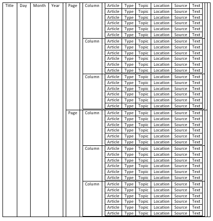
So I tried to think fifth-dimensionally; a flat table of issue information, moving into the third dimension to accommodate separate pages rising out of each issue row. Then, into the fourth to allow separate columns springing from every page and into the fifth to house the many snippets in each column.
If you cannot think in five dimensions, you can also think of nested tables, with a smaller table inside a single cell of a larger table. But I wouldn’t advise this.
In C++, my preferred programming language, nesting can be achieved by placing variables (or bits of information) inside stucts (rows) and structs inside vectors (tables). You can then put those vectors in other structs (rows) which are themselves in vectors (tables) and so on and so on. But try not to think about these as tables in table in tables; it’ll make your brain hurt less later on.
Step four: Breaking down the variables
First, you store individual bits of text in string variables and whole numbers (such as the word count or the date) as integer variables. Think of these as index cards.
You can then place those variables in something called a struct. For example, four string variables — type, topic, location, and source — and an integervariable — wordcount — are placed in a struct called article. This is written as
struct article { string type; string topic; string location; string source; int wordcount; };
Think of this as an plastic photo protector, with a pocket for each of your cards. You then combine these structs (rows) into a vector (table) called articles. Think of this as a metal brad, or paper fastener, holding your plastic sleeves together.
vector <article> articles;
A paper folder, representing your column, is another struct. It contains another integer index card, the column number, and a vector, your bound collection of plastic sleeves.
struct column { int position; vector <article> articles; };
On and on you do this, column into a columns vector, into a page struct, into a pages vector, into an issue struct.
Why go to all this trouble? Why not just store each full set of information in each “row” again and again? The answer is only obvious at the next stage — my next post — but, for the moment think of it this way. If you are trying to quickly find the first article of every second column, which is easier to search through, an organised set of labelled folders or a giant stack of individually labeled index cards?